import pandas as pd
import numpy  as np
import matplotlib.pyplot as plt
import statsmodels.api as sm
from datetime import datetime
import yfinance as yf
# !pip install pandas-datareader
from pandas_datareader import data as pdr
from statsmodels.tsa.seasonal import seasonal_decompose, STL4 Basics of Time Series
Time series data are collected on the same observational unit at multiple time periods, usually at regular intervals (daily, monthly, quarterly, etc.). Unlike cross-sectional data, the order of observations matters, because the past often influences the present and the future.
What makes time series data special?
The key feature of time series data is temporal dependence, it means that today’s value is often related to yesterday’s value. Technical issues arise as a time series variable is generally correlated with one or more of its lagged values; that is, violates the Classical Linear Model assumption of no serial correlation.
Uses of time series data
Forecasting. Predict the demand for electricity
Estimation of dynamic causal effects. If Banxico increases the interest rates now, what will the effect on the rates of inflation and unemployment be in 3 months? in 12 months?
Modeling changing variances and volatility clustering. Frequently use in finance to measure risk.
It is important to understand that forecasting and estimation of causal effects are quite different objectives. For estimation of causal effects, we were concerned about omitting relevant variables, while for forecasting, omitted variable bias is not a problem. Interpreting coefficients in forecasting models is not relevant – no need to estimate causal effects either as the objective of the model is to provide an out-of-sample prediction that is as accurate as possible.
Formally, a time series can be viewed as a stochastic process:
\[ \{Y_t\}_{t \in T} \] Each \(Y_t\) is a random variable, and what we observe is one realization of the process. This perspective is crucial as we will not model just the observed path, but the data-generating process (DGP) behind it.
4.1 Core components
A time series is often easier to understand when we decompose it into interpretable components. This decomposition helps us answer why the series moves the way it does, which helps us to model or forecast it.
The components of a time series are: Trend, Cycle, Seasonality, and the Remainder:
Trend \((T_t)\) captures the long run direction of the series, persistent upward or downward movements. It reflects structural forces rather than short-term fluctuations.
Seasonality \((S_t)\) refers to regular, repeating patterns tied to the calendar. Fixed and known periodicity, e.g., repeats every year, quarter, month, week, or day.
Cycle \((C_t)\). Unlike seasonality, fluctuations in the cycle of the time series occur over long periods of time and are not associated to fixed dates in the calendar.
Remainder \((R_t)\). The remainder absorbs any information in the series that is not contained in the other components.
Additive decomposition
\[ Y_t = T_t + C_t + S_t+R_t \]
Multiplicative decomposition
\[ Y_t = T_t \times C_t \times S_t \times R_t \]
Taking logs converts multiplicative models into additive ones:
\[ log(Y_t) = log(T_t) + log(C_t) + log(S_t) + log(R_t) \]
In applications, trend and cycle are combined into a single component because separating them cleanly is difficult.
In practice
Explore the basic concepts of time series analysis using Mexico’s quarterly GDP data. Begin by visualizing the series and decomposing it into its fundamental components: trend/cycle, seasonality, and remainder. This illustrates the additive structure commonly used in economic and financial data.
Import the libraries
Load the data
GDP = pdr.DataReader('NGDPRNSAXDCMXQ', 'fred', start='1993Q1', end = '2025Q4')
GDP = GDP.rename(columns={'NGDPRNSAXDCMXQ': 'Values'})
GDP = GDP.reset_index()
GDP = GDP.rename(columns={'DATE': 'Date'})
GDP['Date'] = pd.to_datetime(GDP['Date'], dayfirst=True) + pd.offsets.QuarterEnd(0)
GDP['Values'] = GDP['Values']/1000 # Mil millones
Plot the original series
plt.figure(figsize=(7, 5))
plt.plot(GDP['Date'], GDP['Values'])
plt.xlabel('Date')
plt.ylabel('Billions of Mexican Pesos')
plt.title('Mexico Quartely GDP: 1990 to 2025')
plt.tight_layout()
# plt.grid(True)
plt.show()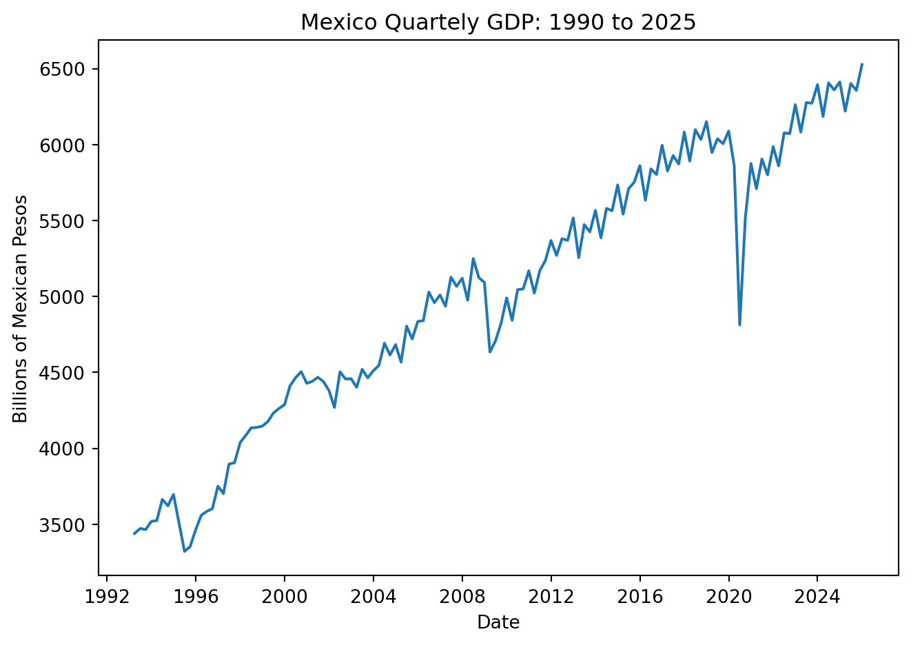
decomp = sm.tsa.seasonal_decompose(GDP['Values'], model='additive', period=4)

fig = decomp.plot()
fig.set_size_inches(7, 5)
plt.tight_layout()
plt.show()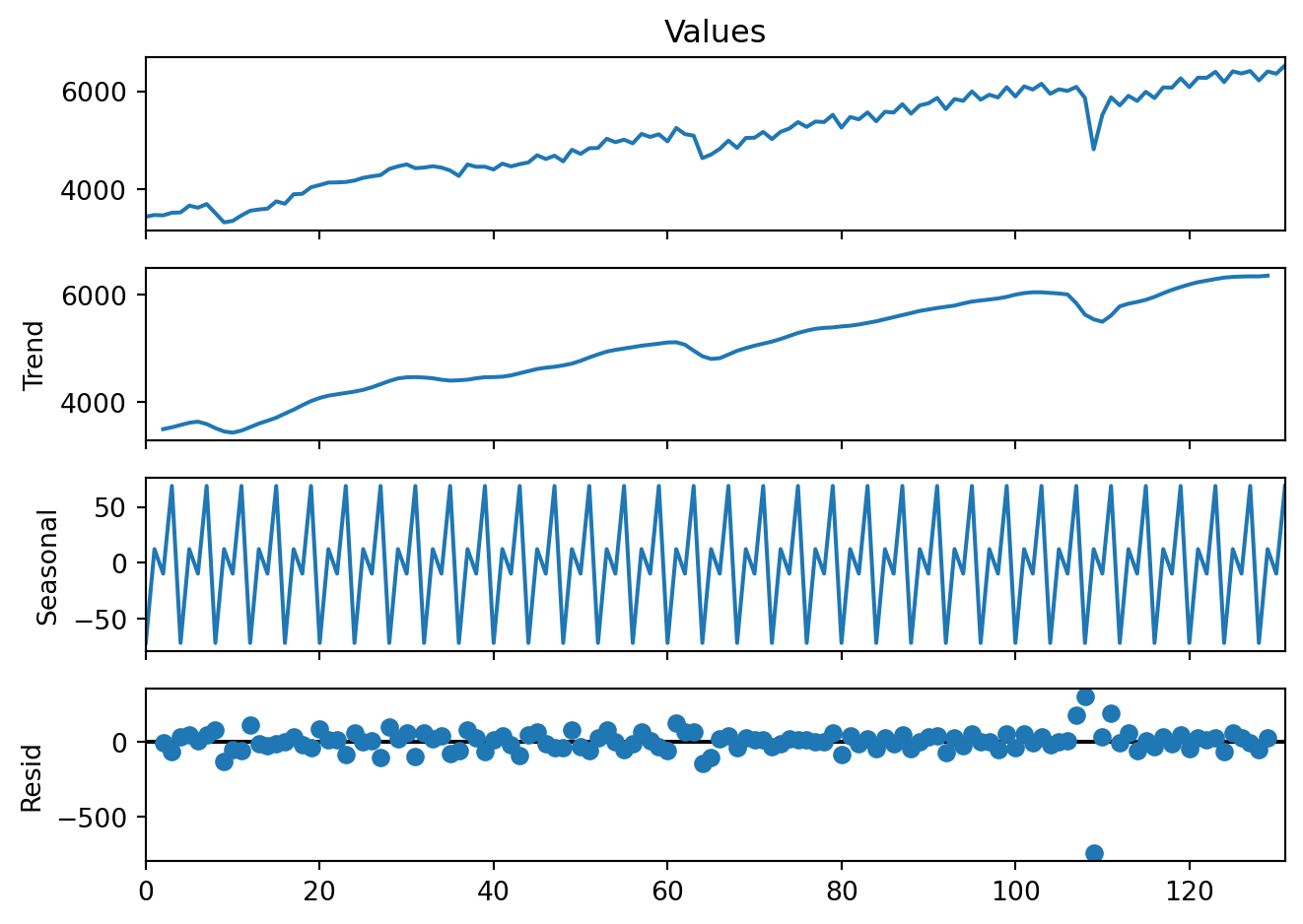
Multiplicative decomposition is rarely used.
decomp2 = sm.tsa.seasonal_decompose(GDP['Values'], model='multiplicative', period=4)
fig = decomp2.plot()
fig.set_size_inches(7, 5)
plt.tight_layout()
plt.show()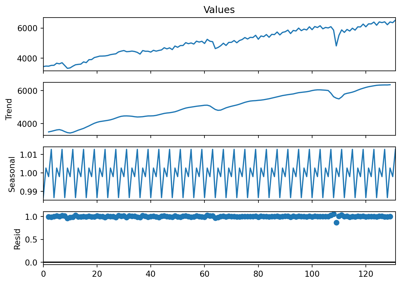
The is classical seasonal decomposition above is based on moving averages (as shown, seasonality is perfectly stable and repeats identically). An alternative, the STL (Seasonal–Trend decomposition using LOESS), is a nonparametric locally weighted regression approach that is often used in practice. STL is preferred because it handles changing seasonality and is robust to outliers.
stl = STL(GDP['Values'], period=4, robust=True)
res = stl.fit()plt.figure(figsize=(7, 5))
res.trend.plot(title='Trend/Cycle Component', ylabel='Trend')
plt.tight_layout()
plt.show()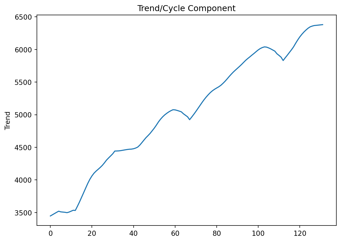
plt.figure(figsize=(7, 5))
res.seasonal.plot(title='Seasonal Component', ylabel='Seasonality')
plt.tight_layout()
plt.show()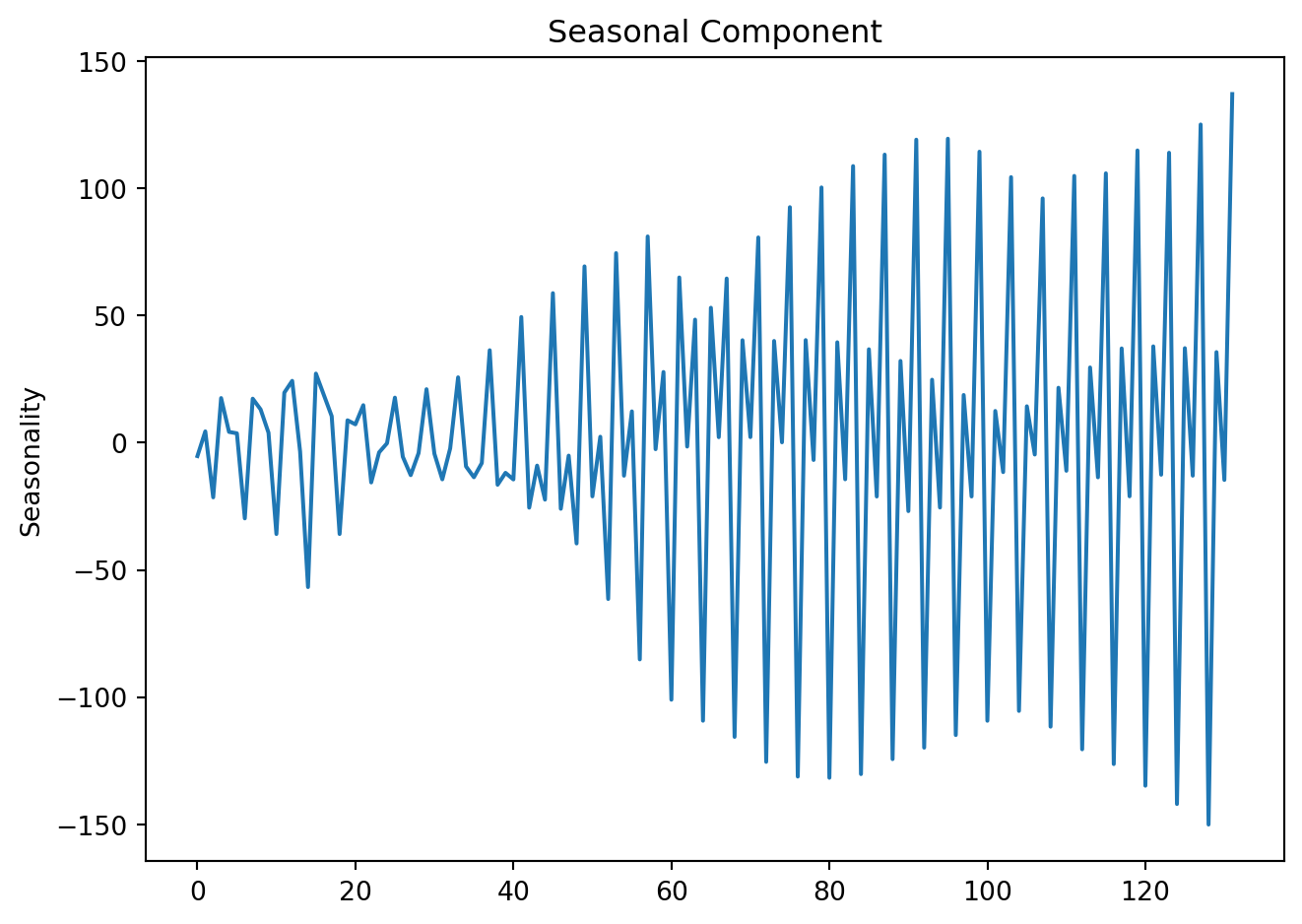
plt.figure(figsize=(7, 5))
res.resid.plot(title='Remainder Component', ylabel='Residual')
plt.tight_layout()
plt.show()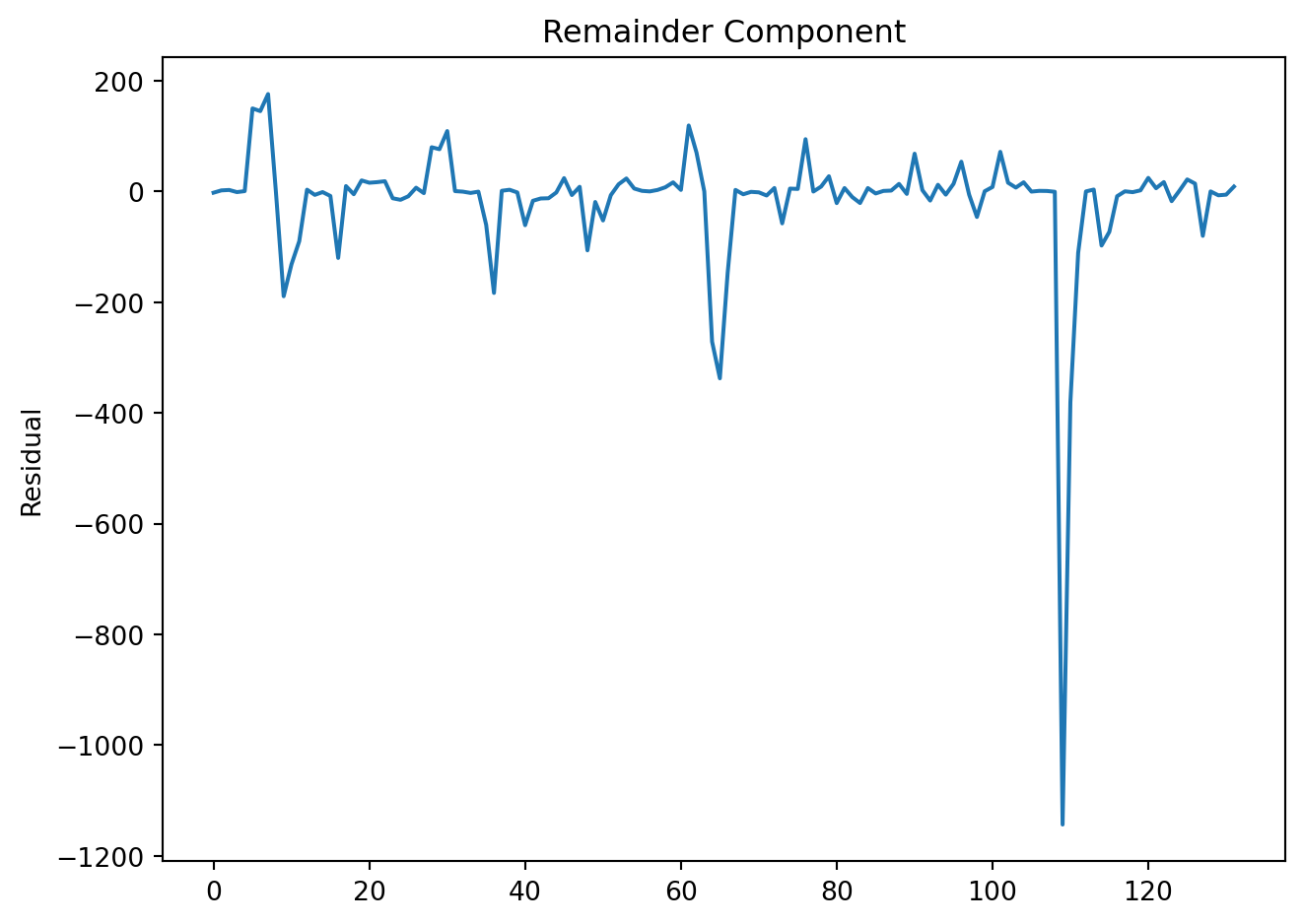
In a single plot:
fig, axes = plt.subplots(4, 1, figsize=(7, 7), sharex=True)

GDP['Values'].plot(ax=axes[0], title='Mexico Quarterly GDP', ylabel='Level')
res.trend.plot(ax=axes[1], title='Trend/Cycle')
res.seasonal.plot(ax=axes[2], title='Seasonality')
res.resid.plot(ax=axes[3], title='Remainder')

for ax in axes:
    ax.grid(False)

plt.tight_layout()
plt.show()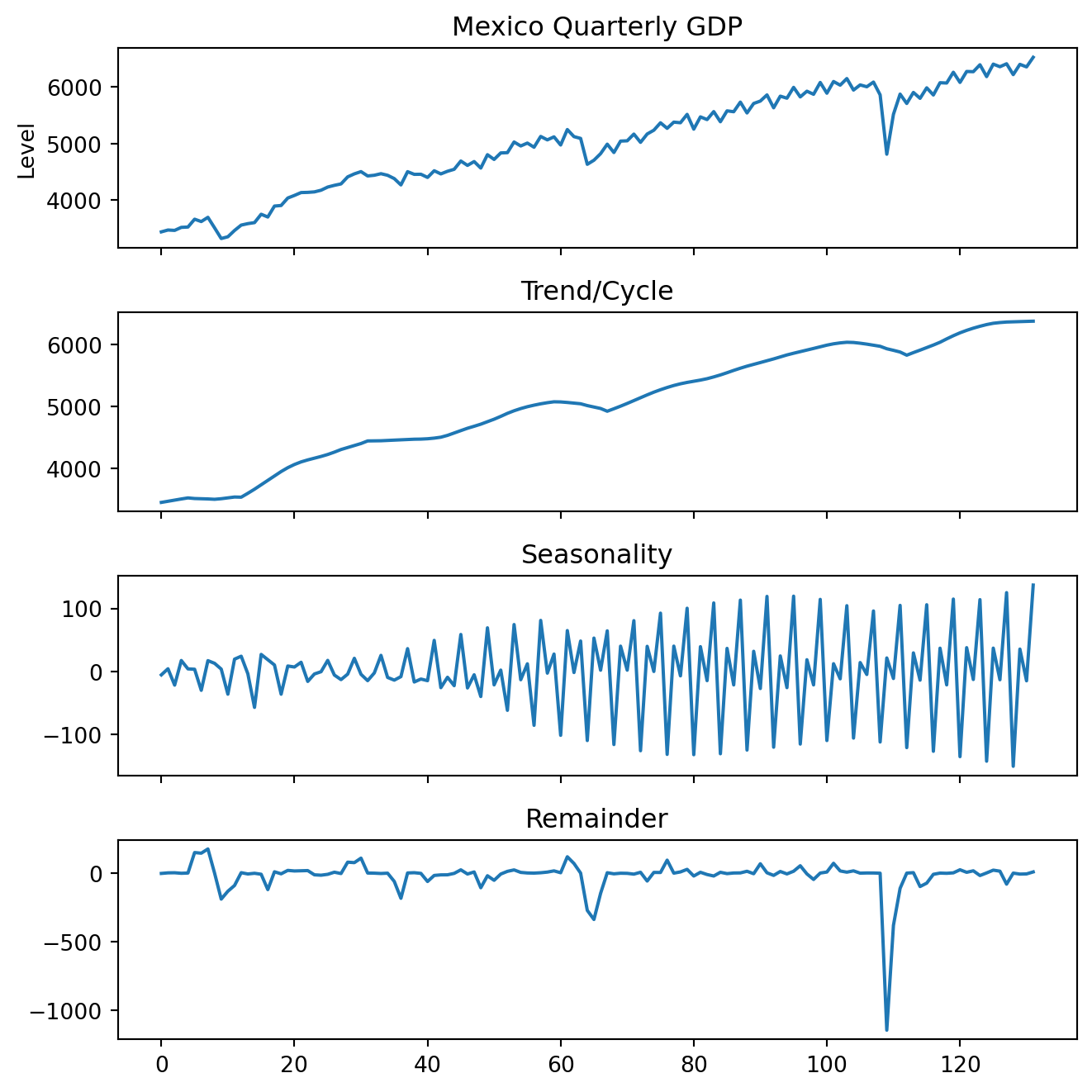
4.1.1 Seasonal adjustment
A seasonal adjustment is simply the act of removing the seasonal component:
\[ Y^A_t = Y_t - S_t \] Because seasonal effects are known and repetitive, comparisons would otherwise be misleading. Seasonally adjusted data are often reported by national statistics agencies, allowing us to:
Compare period-to-period movements
Detect turning points
Interpret shocks without calendar noise
GDP['Deseasonalized'] = GDP['Values'] - res.seasonalplt.figure(figsize=(7, 5))
plt.plot(GDP['Date'], GDP['Values'], label='GDP', linewidth=2, color = 'steelblue')
plt.plot(GDP['Date'], GDP['Deseasonalized'], label='Seasonally Adjusted',color = 'red', linewidth=2)
plt.xlabel('Date')
plt.ylabel('GDP (Billions of Pesos)')
plt.title('Original vs. Seasonally Adjusted GDP')
plt.legend()
# plt.grid(True)
plt.tight_layout()
plt.show()Original vs. Seasonally Adjusted GDP
4.2 Lags, differences, and growth rates
4.2.1 Lags
The first lag of a time series \(Y_t\), \(Y_{t-1}\), is written as:
\[ L(Y_t) = Y_{t-1} \]
The jth lag is \(Y_{t-j}\):
\[ L^j(Y_t) = Y_{t-j} \]
4.2.2 Differences
The first difference of a series, \(\Delta Y_t\), is its change between periods \(t\) and \(t-1\):
\[ \Delta Y_t = Y_t - Y_{t-1} = (1-L)Y_t \]
In general, the k\(th\) difference is:
\[ \Delta ^k Y_t = (1-L^k)Y_t \]
Many forecasting models require stationary series (no trend, stable variance). We often use the following transformations to achieve this:
First difference: removes trend by subtracting the previous observation.
Seasonal difference: removes recurring seasonal patterns.
Growth rates: express relative changes, often more interpretable for managers.
GDP['First_Diff'] = GDP['Values'].diff(1)

plt.figure(figsize=(7, 5))
plt.plot(GDP['Date'], GDP['First_Diff'])
plt.title('First Difference of GDP')
plt.xlabel('Date')
plt.ylabel('Billions of Mexican Pesos')
plt.tight_layout()
plt.show()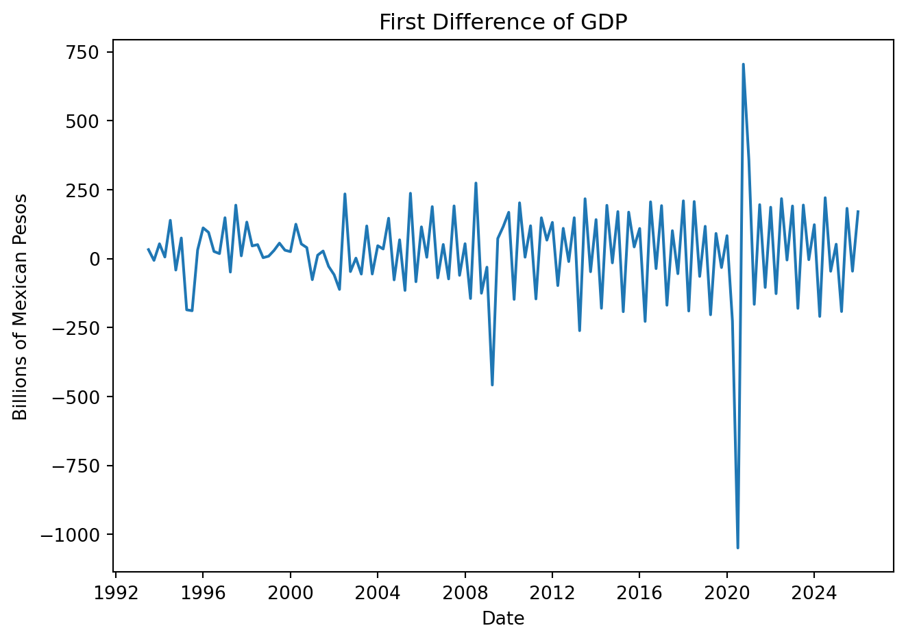
GDP['Quarter_Diff'] = GDP['Values'].diff(4)

plt.figure(figsize=(7, 5))
plt.plot(GDP['Date'], GDP['Quarter_Diff'])
plt.title('Quarterly Difference of GDP')
plt.xlabel('Date')
plt.ylabel('Billions of Mexican Pesos')
plt.tight_layout()
plt.show()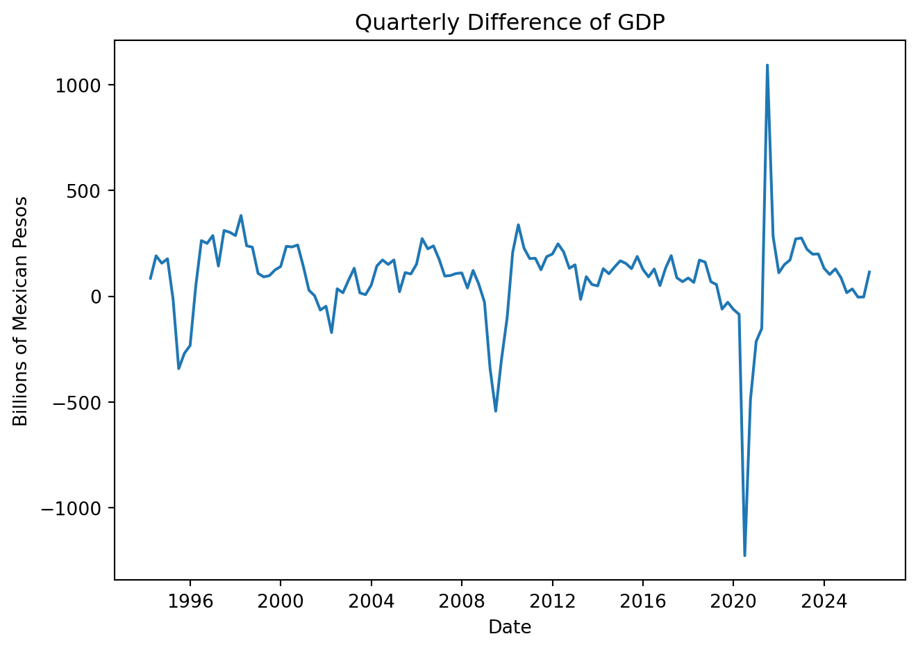
4.2.3 Growth rates
The growth rate is used to express relative change, this is:
\[ \Delta\% Y_t \equiv \frac{Y_t - Y_{t-1}}{Y_{t-1}} \times 100 \] Limitation: changes are not symmetric. Growth from 100 to 125 is not equal to 125 to 100. Log growth is preferred:
\[ \Delta\%Y_t \approx 100 [log(Y_t)-log(Y_{t-1})] \]
GDP['Growth'] = GDP['Values'].pct_change(1) * 100
# GDP['Growth_YoY'] = GDP['Values'].pct_change(4) * 100 # wrt to previous quarter

plt.figure(figsize=(7, 5))
plt.plot(GDP['Date'], GDP['Growth'])
plt.title('Quarterly GDP Growth')
plt.xlabel('Date')
plt.ylabel('Percent')
plt.tight_layout()
plt.show()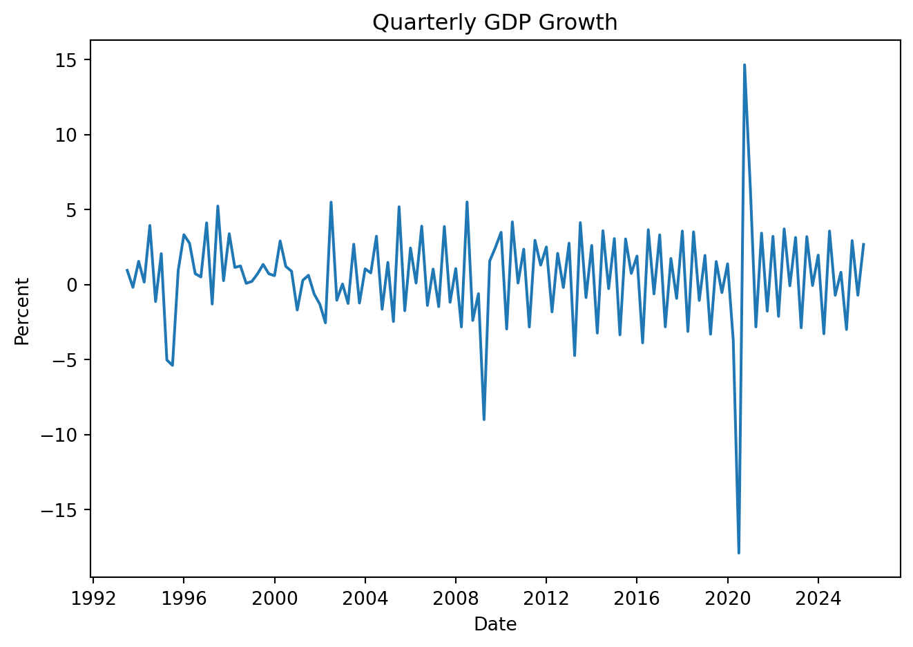
Same result using:
GDP['Log_Growth'] = np.log(GDP['Values']).diff() * 100

plt.figure(figsize=(7, 5))
plt.plot(GDP['Date'], GDP['Log_Growth'])
plt.title('Quarterly Growth of GDP')
plt.xlabel('Date')
plt.ylabel('Percent')
plt.tight_layout()
plt.show()
Note that: \[ \begin{align*}\Delta_4\% y_t &\approx \left(\ln y_t - \ln y_{t-4}\right)\times 100 \\ &= \left(\ln y_{t} - \ln y_{t-1} + \ln y_{t-1} - \ln y_{t-2} + \ln y_{t-2} - \ln y_{t-3} + \ln y_{t-3} - \ln y_{t-4}\right)\times 100 \\ &= \Delta\% y_{t} + \Delta\% y_{t-1} + \Delta\% y_{t-2} + \Delta\% y_{t-3}\end{align*} \] So the inter-annual growth rate can be calculated as:
GDP['Year_Growth'] = np.log(GDP['Values']).diff(4) * 100

plt.figure(figsize=(7, 5))
plt.plot(GDP['Date'], GDP['Year_Growth'])
plt.title('Inter-Annual Growth of GDP')
plt.xlabel('Date')
plt.ylabel('Percent')
plt.tight_layout()
plt.show()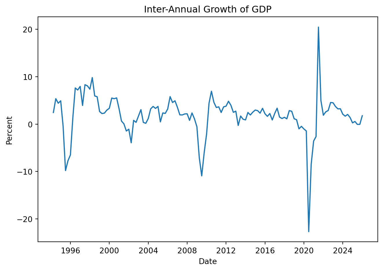
Using seasonally adjusted data to calculate annual grow-rates:
GDP['L_Growth_SA'] = np.log(GDP['Deseasonalized']).diff() * 100
GDP['Year'] = GDP['Date'].dt.year

annual_growth = GDP.groupby('Year')['L_Growth_SA'].sum().round(2)
annual_growth_table = (
    annual_growth
    .reset_index()
    .rename(columns={"L_Growth_SA": "Annual GDP Growth (%)"})
)

annual_growth_table.tail(10)| Year | Annual GDP Growth (%) | |
|---|---|---|
| 23 | 2016 | 2.29 |
| 24 | 2017 | 1.55 |
| 25 | 2018 | 1.32 |
| 26 | 2019 | -0.89 |
| 27 | 2020 | -3.77 |
| 28 | 2021 | 1.89 |
| 29 | 2022 | 4.43 |
| 30 | 2023 | 2.15 |
| 31 | 2024 | 0.10 |
| 32 | 2025 | 1.62 |
Quarterly log growth rates add up to annual growth
4.3 Moving averages
A simple moving average (MA) is calculated by taking the arithmetic mean of a given set of values over a specified number of periods.
\[ MA_k \equiv \tfrac{1}{k}\left(Y_t + Y_{t-1} + Y_{t-2} + Y_{t-3} + \cdots + Y_{t-k-1}\right) \]
The average eliminates seasonality in the data, leaving a smooth trend-cycle component.
GDP['MA_4'] = GDP['Values'].rolling(window=4).mean()

plt.figure(figsize=(7, 5))
plt.plot(GDP['Date'], GDP['Values'], label='Original GDP', color = 'steelblue', linewidth=2)
plt.plot(GDP['Date'], GDP['MA_4'], label='4-Period Moving Average', color = 'slategray', linewidth=2)
plt.xlabel('Date')
plt.ylabel('GDP (Billions of Pesos)')
plt.title('GDP and 4-Period Moving Average')
plt.legend()
plt.tight_layout()
plt.show()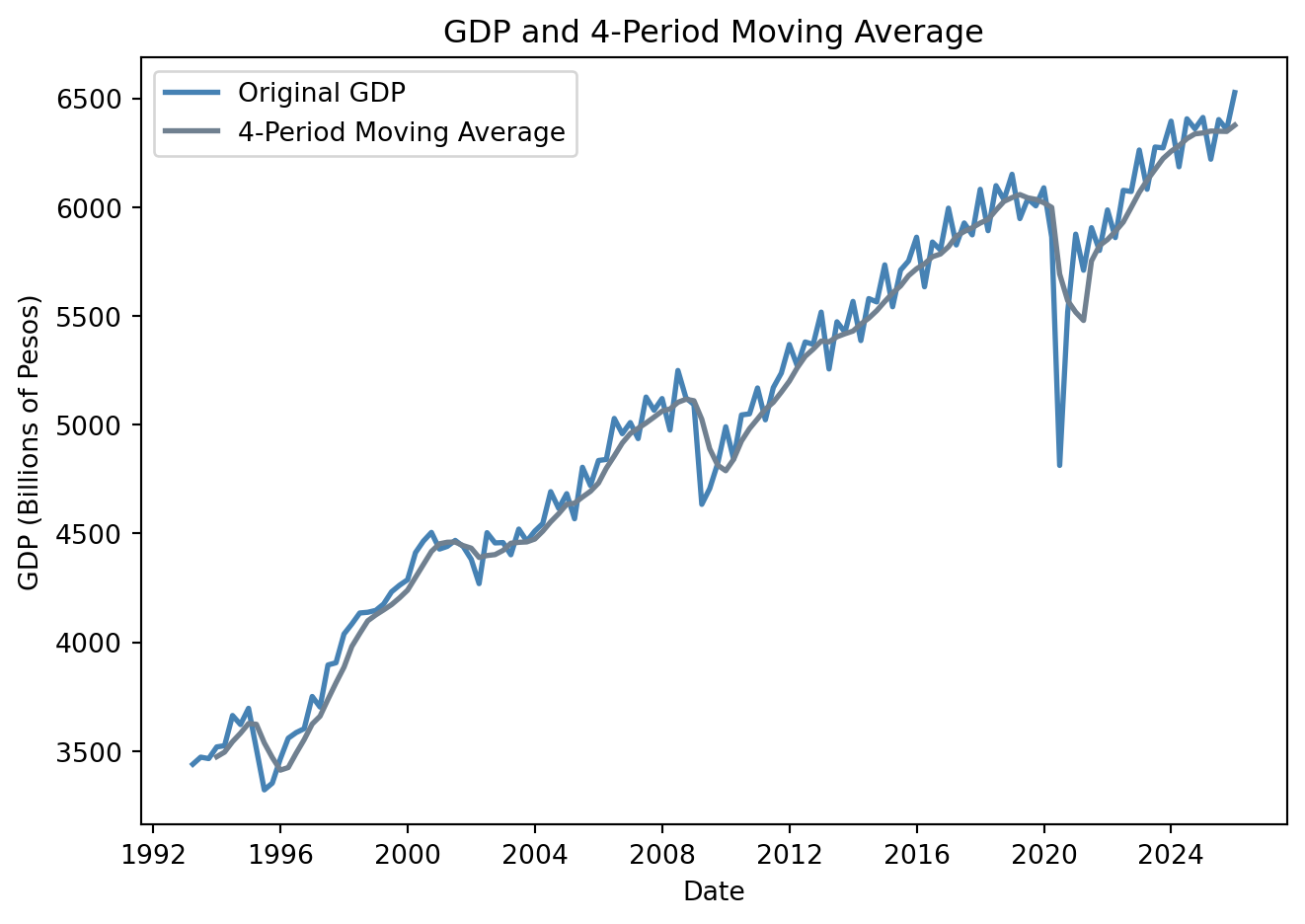
4.4 Autocorrelation
The correlation of a series with its own lagged values is called autocorrelation or serial correlation. The first autocorrelation of \(y_t\), \(\rho_1\), is: \[ \rho_1 = Corr(y_t,y_{t-1})=\frac{Cov(y_t,y_{t-1})}{\sqrt{Var(y_t)} \sqrt{Var(y_{t-1})} } \] The \(jth\) sample autocorrelation coefficient, \(\rho_j\) is the correlation between \(y_t\) and \(y_{t-j}\):
\[ \rho_j = Corr(y_t,y_{t-j})=\frac{Cov(y_t,y_{t-j})}{\sqrt{Var(y_t)} \sqrt{Var(y_{t-j})} } \]
rho1 = GDP['Values'].autocorr(lag=1)
rho2 = GDP['Values'].autocorr(lag=2)
rho3 = GDP['Values'].autocorr(lag=3)
rho4 = GDP['Values'].autocorr(lag=4)

# Store results
autocorr_values = {
    'rho 1': rho1,
    'rho 2': rho2,
    'rho 3': rho3,
    'rho 4': rho4
}

autocorr_table = pd.DataFrame.from_dict(autocorr_values, orient='index', columns=['Autocorrelation'])
autocorr_table.index.name = 'Lag'

autocorr_table| Autocorrelation | |
|---|---|
| Lag | |
| rho 1 | 0.979881 |
| rho 2 | 0.975197 |
| rho 3 | 0.966335 |
| rho 4 | 0.969509 |
The set of autocorrelation coefficients is called the autocorrelation function or ACF
4.4.1 Autocorrelation function (ACF)
from statsmodels.graphics.tsaplots import plot_acf

plot_acf(GDP['Values'], lags=36, zero=False)
plt.title('Autocorrelation Function (ACF) of Mexico GDP')
plt.xlabel('Lag')
plt.ylabel('Autocorrelation')
plt.tight_layout()
plt.show()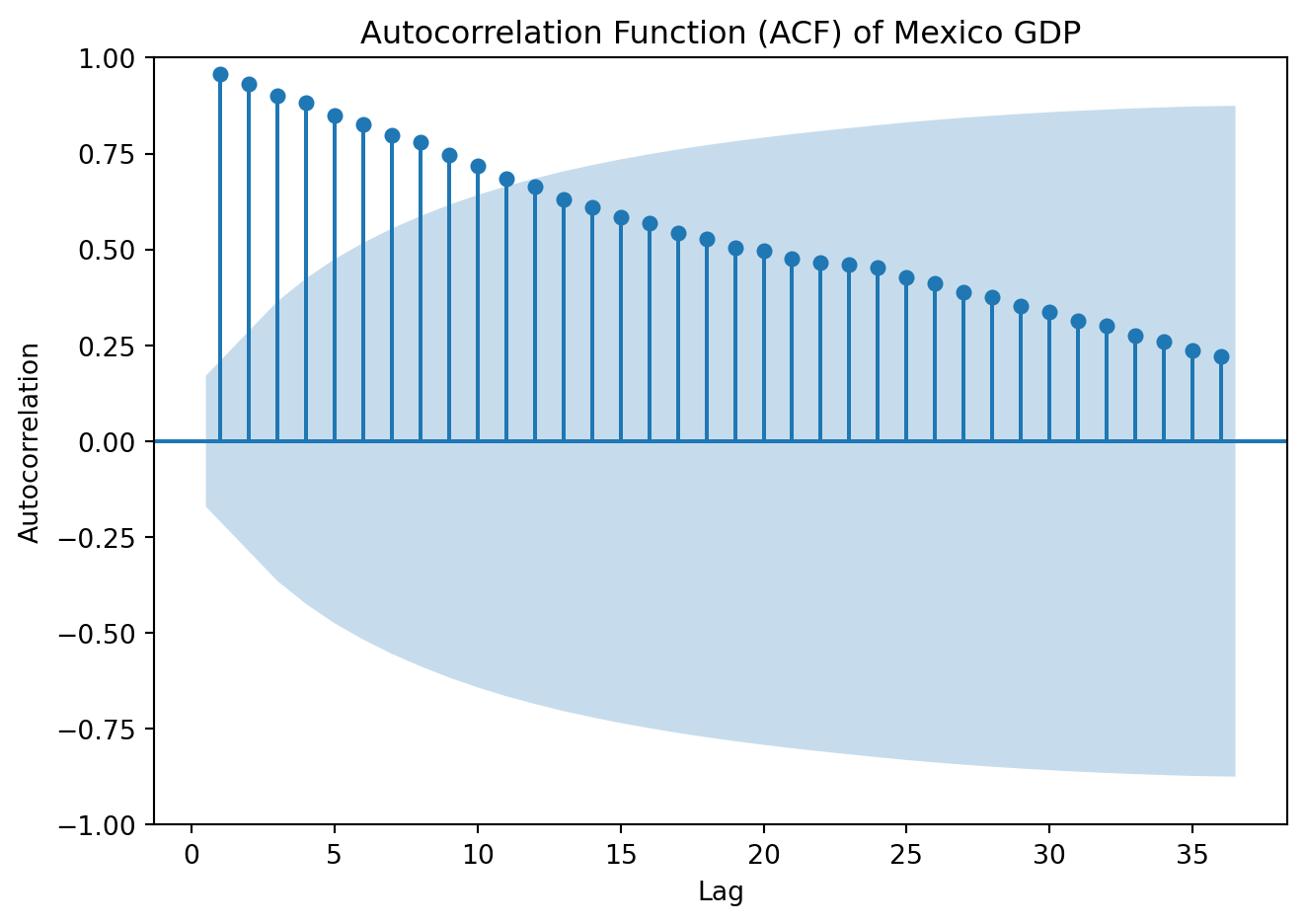
4.4.2 Partial Autocorrelation function (PACF)
The autocorrelation between \(y_t\) and \(y_{t-2}\), could be due to effect of \(y_{t-1}\), rather than because \(y_{t-2}\) contains useful information to forecast \(y_t\). Partial autocorrelations measure the relationship between \(y_t\) and \(y_{t-k}\) after removing the effects of the variable in between, \(\{y_{t-1}, y_{t-2}, \dots, y_{t-k+1}\}\).
from statsmodels.graphics.tsaplots import plot_pacf

plot_pacf(GDP['Values'], lags=36, zero=False, method = 'ols')
plt.title('Partial autocorrelation Function (PACF) of Mexico GDP')
plt.xlabel('Lag')
plt.ylabel('Autocorrelation')
plt.tight_layout()
plt.show()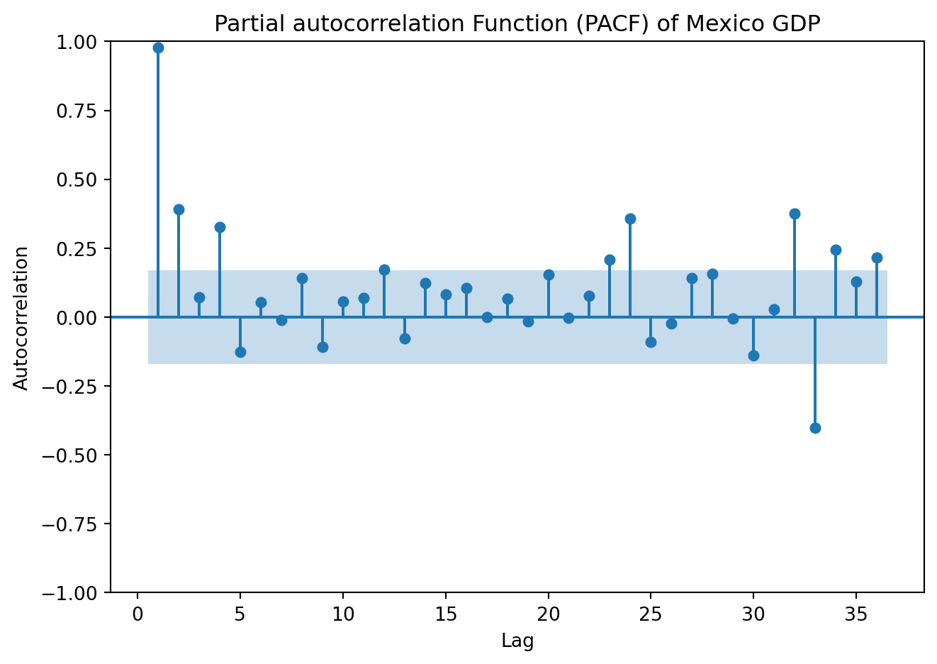
4.5 Stationarity
A time series was earlier defined as a stochastic process, i.e., a collection of random variables indexed over time \(\{Y_t\}^{\infty}_{-\infty}\). Our focus here is discrete-time stochastic processes, where the number of realizations can be counted, \(Y_t \in \{y_1,y_2,\cdots, y_n\}\). From a stochastic process, also called data generating process, what we observe in real data is only one realization. In other words, the time series we observe is one possible realization (or sample path) of an underlying stochastic process.
A process \(Y_t\) is stationary if its probability distribution (the statistical properties) are constant over time, that is, if the joint distribution of \((Y_{s+1}, Y_{s+2},…, Y_{s+T})\) does not depend on \(s\). Stationarity implies that the past is informative for predicting the future, a key requirement for ensuring the validity of forecasts based on time series models.
Since strict stationarity is difficult to verify in practice, we usually work with the more tractable version. A process is weakly or covariance stationary if:
The mean is constant over time: \(E[Y_t] = \mu\)
The variance is constant over time: \(Var[Y_t]=\sigma^2\)
The autocovariance depends only on the lag \(h\): \(E\left(Y_t-\mu\right)\left(Y_{t-h}-\mu\right) =\gamma_h\)
The average value of the series remains the same over time, the variability of the data doesn’t increase or decrease over time, and the correlation between values at different lags depends only on the lag, not on the time at which it is calculated.
NoteWhite noise
White noise is a special case of a stationary process. Consider a process \(\{ \varepsilon_t \}\), if:
\(E(\varepsilon_t)=0\)
\(E(\varepsilon_t^2)=\sigma^2\)
\(E(\varepsilon_t \varepsilon_j) = 0 \ \ t \ne j\)
\(\varepsilon_t\) is white noise. That is, the series has zero mean, constant variance, and no autocorrelation. This satisfies all stationarity conditions, but has no predictable structure, no memory. The series fluctuates randomly around a constant mean.
The key to identify white noise is the autocorrelation function, as
\[ \rho_j = 0 \ \ \ \forall j \neq 0 \]
all autocorrelations at nonzero lags should be within the approximate confidence bands close to zero.
A formal test for white noise is the Ljung–Box test (Ljung and Box 1978) for the joint hypothesis that autocorrelations up to lag \(h\) are all zero. Formally:
\[ H_0: \rho_1 = \rho_2 = \cdots = \rho_h =0 \ \ \ \text{white noise} \]
\[ H_1: \text{At least one} \ \ \rho_k \ne 0 \]
Reject the null if \(p-val< \alpha\) [significance level] \(\rightarrow\) evidence of serial correlation
A time series is non-stationary when at least one of its key statistical properties changes over time. In particular, if series exhibit a time-varying mean, variance, or dependence structure, the process is nonstationary. Trends are one of the main sources of non-stationarity:
A deterministic trend is a nonrandom function of time (e.g. \(Y_t = t\), or \(Y_t = t^2\)). The mean changes systematically over time and once the trend is removed (differencing), the remaining series may be stationary
A stochastic trend is random and varies over time. A relevant example of a stochastic trend is a random walk:
\[ Y_t = Y_{t-1} + \varepsilon_t \]
If \(Y_t\) follows a random walk, then the value of \(Y\) tomorrow is the value of \(Y\) today, plus an unpredictable disturbance. The best prediction of the value of \(Y\) next period is its value today. Shocks have permanent effects, variance grows over time, the process is therefore non-stationary. This is known as a unit root process. \(\varepsilon_t\) is assumed to be white noise.
Recursively:
\[ Y_t = Y_0 + \sum^{t}_{j=1}\varepsilon_j \] Mean:
\[ E[Y_t] = E[Y_0] + \sum^{t}_{j=1}E[\varepsilon_j] = E[Y_0] \]
Assume for simplicity that \(Y_0\) is constant, then the mean is constant over time. It shows the non-stationarity does not come from a changing mean in this random walk.
Variance:
\[ Var[Y_t] = Var[Y_0] + Var \left( \sum^{t}_{j=1} \varepsilon_j \right) = Var[Y_0] + \sum^{t}_{j=1} \sigma^2 = Var[Y_0] + t \sigma^2 \]
Variance grows linearly with time. Every new \(\varepsilon_t\) adds another \(\sigma^2\) to the variance. In the case where \(Y_0\) is fixed: \(Var[Y_t] = t \sigma^2\). Because variance is not constant, the process is non-stationary.
In contrast, the process:
\[ Y_t = \phi Y_{t-1} + \varepsilon_t \]
with \(|\phi|<1\), is stationary. Note:
\[ Y_t = \phi Y_{t-1} + \varepsilon_t = \phi (\phi Y_{t-2} + \varepsilon_{t-1}) + \varepsilon_t = \phi^2Y_{t-2} + \phi\varepsilon_{t-1} + \varepsilon_t \]
\[ \vdots \]
\[ Y_t = \phi^tY_{0} + \sum ^t_{j=1} \phi^{t-j}\varepsilon_j \]
Mean:
\[ E[Y_t] = \phi^t E[Y_0] + \sum^{t}_{j=1} \phi^{t-j}E[\varepsilon_j] = \phi^tE[Y_0], \ \text{which} \rightarrow 0 \ \text{as} \ t\rightarrow \infty \]
Variance:
\[ Var(Y_t)=\phi^t Var(Y_0) + Var \left(\sum^t_{j=1} \phi^{t-j}\varepsilon_t \right) = \sum^t_{j=1}\phi^{2(t-j)}Var(\varepsilon_j) \]
\[ Var(Y_t)= \sigma^2 \sum^t_{j=1}\phi^{2(t-j)} = \sigma^2(\phi^{2(t-1)}+\phi^{2(t-2)} + \cdots + \phi^{2(0)}) = \sigma^2 \sum^{t-1}_{k=0}\phi^{2k} \]
\[ Var(Y_t)= \sigma^2 \frac{1-\phi^{2t}}{1-\phi^2}, \ \text{which} \rightarrow \frac{\sigma^2}{1-\phi^2} \ \text{as} \ t\rightarrow \infty \]
Both, the mean and variance converge to constants, the process is stationary.
Examine features of the following processes:
Show code
np.random.seed(42)
T = 500

y   = np.zeros(T)
rho = 0.8
e   = np.random.normal(0, 1, T)

for t in range(1, T):
    y[t] = rho * y[t-1] + e[t]

data = pd.DataFrame({
    'y':y}, index=pd.date_range(start='1990-01-01', periods=T, freq='ME'))
data = data.reset_index()
data = data.rename(columns={'index': 'Date'})
Show code
plt.figure(figsize=(7, 5))
plt.plot(data['Date'], data['y'])
plt.xlabel('Date')
plt.ylabel('Value')
plt.title('A Stationary Times Series')
plt.tight_layout()
# plt.grid(True)
plt.show()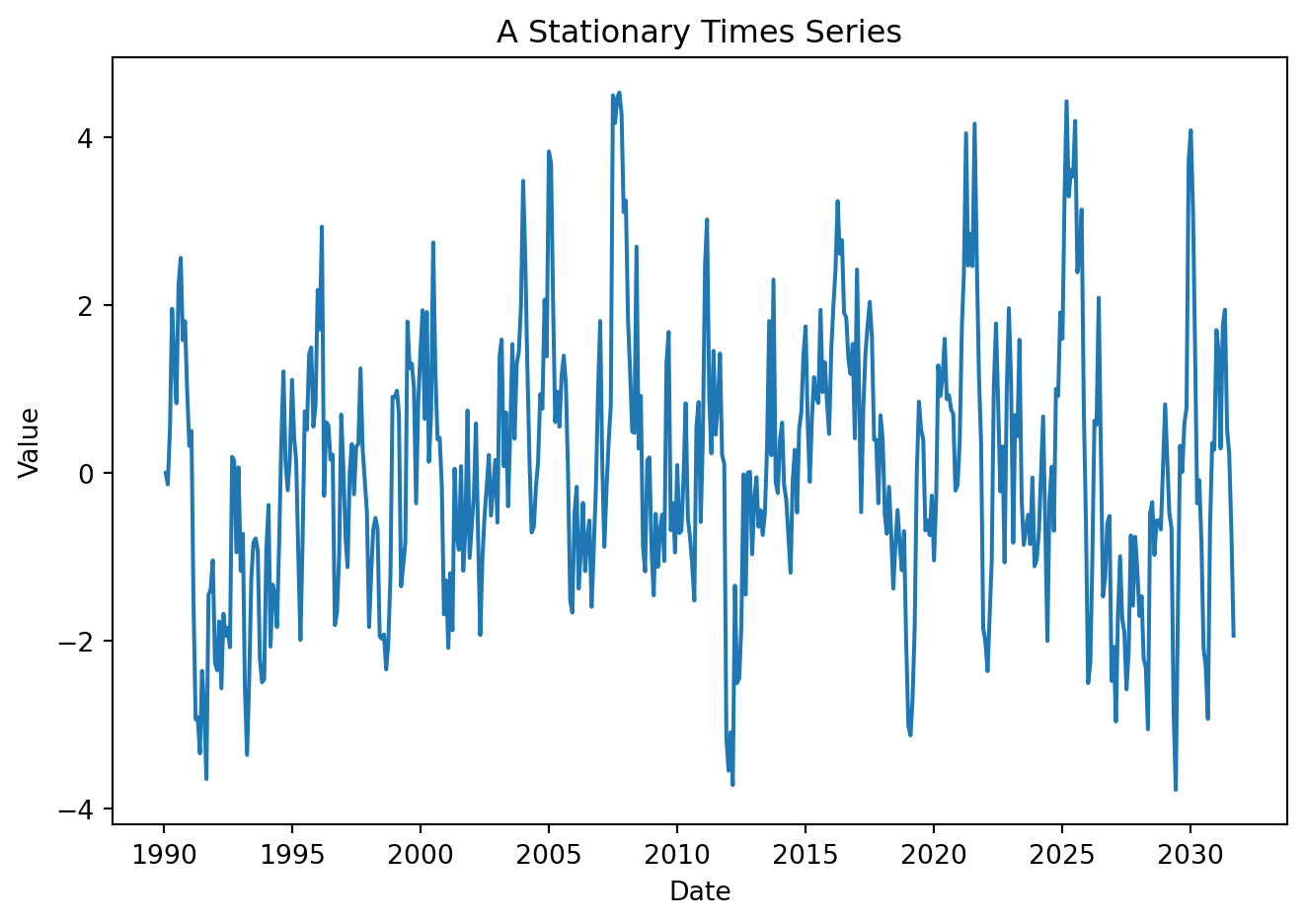
ACF
Show code
plot_acf(data['y'], lags=36, zero=False)
plt.title('Autocorrelation Function (ACF)')
plt.xlabel('Lag')
plt.ylabel('Autocorrelation')
plt.tight_layout()
plt.show()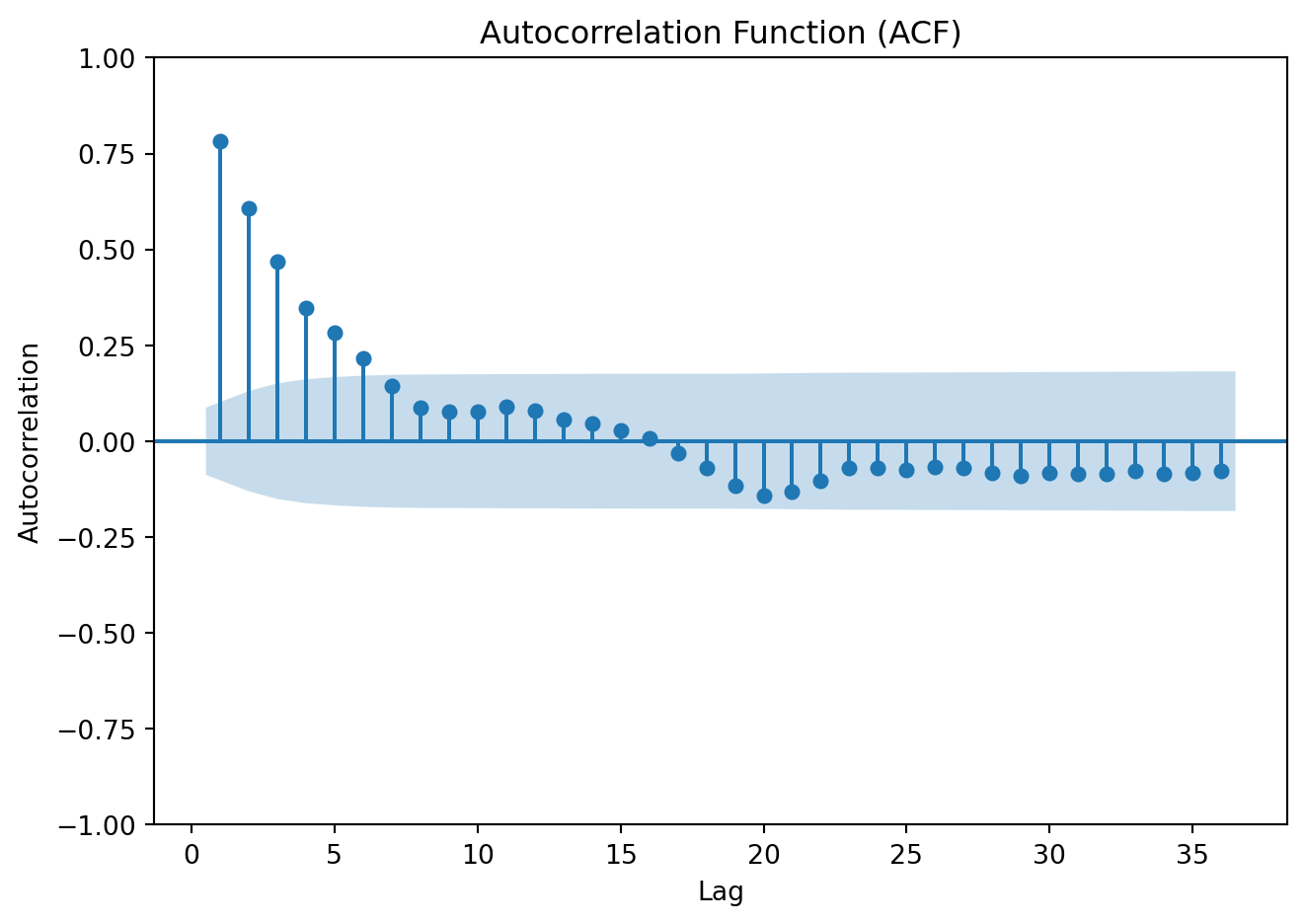
Ljun-Box test
Show code
from statsmodels.stats.diagnostic import acorr_ljungbox

lb_test = acorr_ljungbox(
    data['y'],
    lags=10,
    return_df=True
)['lb_pvalue'].iloc[0]

print(f"Ljung-Box p-value: {lb_test:.4f}")
Ljung-Box p-value: 0.0000Show code
y1 = np.random.normal(0, 1, T)
data['y1'] = y1


plt.figure(figsize=(7, 5))
plt.plot(data['Date'], data['y1'])
plt.xlabel('Date')
plt.ylabel('Value')
plt.title('Stationary Times Series: White Noise')
plt.tight_layout()
# plt.grid(True)
plt.show()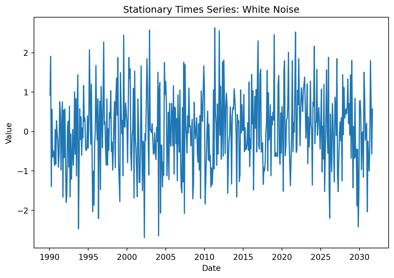
ACF
Show code
plot_acf(data['y1'], lags=36, zero=False)
plt.title('Autocorrelation Function (ACF)')
plt.xlabel('Lag')
plt.ylabel('Autocorrelation')
plt.tight_layout()
plt.show()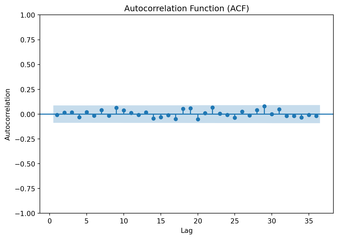
Ljun-Box test
Show code
lb_test_wn = acorr_ljungbox(
    data['y1'],
    lags=10,
    return_df=True
)['lb_pvalue'].iloc[0]

print(f"Ljung-Box p-value: {lb_test_wn:.4f}")
Ljung-Box p-value: 0.8475Show code
y2   = np.zeros(T)
rho1 = 1
e2   = np.random.normal(0, 1, T)
for t in range(1, T):
    y2[t] = rho1 * y2[t-1] + e2[t]

data['y2'] = y2


plt.figure(figsize=(7, 5))
plt.plot(data['Date'], data['y2'])
plt.xlabel('Date')
plt.ylabel('Value')
plt.title('Non-Stationary Times Series: Random Walk')
plt.tight_layout()
# plt.grid(True)
plt.show()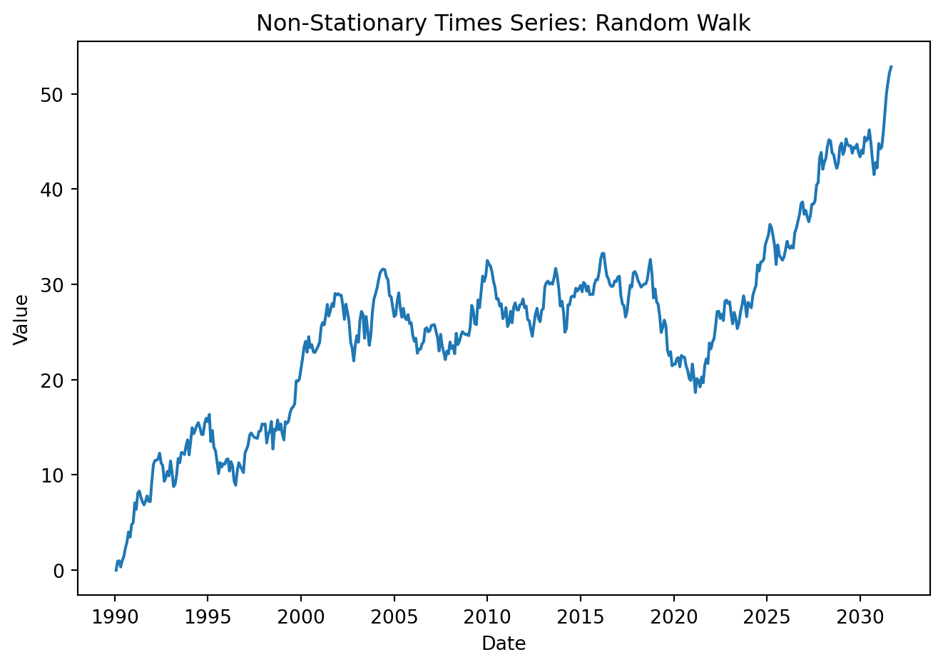
ACF
Show code
plot_acf(data['y2'], lags=36, zero=False)
plt.title('Autocorrelation Function (ACF) of Mexico GDP')
plt.xlabel('Lag')
plt.ylabel('Autocorrelation')
plt.tight_layout()
plt.show()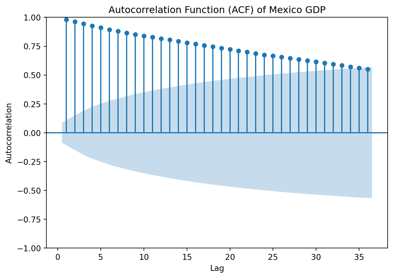
Ljun-Box test
Show code
lb_test_rw = acorr_ljungbox(
    data['y1'],
    lags=10,
    return_df=True
)['lb_pvalue'].iloc[0]

print(f"Ljung-Box p-value: {lb_test_rw:.4f}")
Ljung-Box p-value: 0.84754.5.1 Stationarity tests
The plot of the series is helpful to visually detect whether persistent long run movements are present. But before specifying any time-series model, it is essential to formally assess whether a series is stationary or non-stationary.
The Dicky-Fuller test (Dickey and Fuller 1979)
Begin with a simple model:
\[ Y_t = \beta Y_{t-1}+ \varepsilon_t \]
A stochastic trend arises when the series follows a random walk \(\beta =1\).
\[ Y_t - Y_{t-1} = (\beta-1)Y_{t-1} + \varepsilon_t \ \ \Rightarrow \Delta Y_t = \gamma Y_{t-1} + \varepsilon_{t} \] \[ H_0: \gamma = 0 \ [\beta=1] \ \ \rightarrow \text{unit root (nonstationary)} \] \[ H_1: \gamma <0 \ [\beta< 1] \ \ \rightarrow \text{stationary} \] Estimate the regression by OLS and compute the t-statistic to test the null hypotheses. However, under the hypothesis of unit root, the statistic does not have a normal distribution. A different set of critical values is required, but can be easily obtained in Python.
In practice, the specification above is extended to include lagged differences to control for serial correlation. With \(p\) lags:
\[ \Delta Y_t = \beta_0 + \beta_1 t+ \gamma Y_{t-1} + \sum^p_{i=1} \delta_i \Delta Y_{t-i}+ \varepsilon_{t} \]
The t-statistic testing the hypothesis that \(\gamma = 0\) is the augmented Dickey–Fuller (ADF) statistic.
Three common specifications derive:
Without constant or trend \((\beta_0 = \beta_1 = 0)\)
With constant \((\beta_0 \ne 0, \beta_1 = 0)\)
With constant and trend: \((\beta_0 \ne 0 , \beta_1 \ne 0)\)
Under the null hypothesis that \(\gamma = 0\), \(Y_t\) has a stochastic trend; under the alternative hypothesis that \(\gamma < 0\), \(Y_t\) is stationary.
The KPSS Test (Kwiatkowski et al. 1992) similarly helps to check for stationarity. Analysts often use both the ADF and KPSS tests to cross-check conclusions. There are two main variants: level stationarity (around a constant) and trend stationarity (around a deterministic trend). The null hypothesis states that the series is stationary, the series has a unit root (is non-stationary) is the alternative.
Implement the test to the three processes generated above:
from statsmodels.tsa.stattools import adfuller, kpss

adf_st   = adfuller(y)[1]
kpss_st = kpss(y, regression='c', nlags='auto')[1]

print(f"ADF p-value: {adf_st:.4f}")
print(f"KPSS p-value: {kpss_st:.4f}")
ADF p-value: 0.0000
KPSS p-value: 0.1000adf_wn = adfuller(y1)[1]
kpss_wn = kpss(y1, regression='c', nlags='auto')[1]
print(f"ADF p-value: {adf_wn:.4f}")
print(f"KPSS p-value: {kpss_wn:.4f}")ADF p-value: 0.0000
KPSS p-value: 0.0748adf_rw = adfuller(y2)[1]
kpss_rw = kpss(y2, regression='c', nlags='auto')[1]
print(f"ADF p-value: {adf_rw:.4f}")
print(f"KPSS p-value: {kpss_rw:.4f}")ADF p-value: 0.7813
KPSS p-value: 0.0100
NotePractice
Download the stock prices of The Boeing Company (BA) from May 2020 to the most recent available observation. Is the time series stationary? Is it white noise?. Use plots for visual inspection and apply the appropriate statistical tests to justify your answers.
To get you started:
ba_all = yf.download("BA", start="2020-05-01", end=None, auto_adjust=True, progress=False)
ba_pr  = ba_all['Close'].reset_index()
ba_pr['Date']  = pd.to_datetime(ba_pr['Date']).dt.date
Dickey, David A., and Wayne A. Fuller. 1979. “Distribution of the Estimators for Autoregressive Time Series with a Unit Root.” Journal of the American Statistical Association 74 (366a): 427–31. https://doi.org/10.1080/01621459.1979.10482531.
Kwiatkowski, Denis, Peter C. B. Phillips, Peter Schmidt, and Yongcheol Shin. 1992. “Testing the Null Hypothesis of Stationarity Against the Alternative of a Unit Root.” Journal of Econometrics 54 (1-3): 159–78. https://doi.org/10.1016/0304-4076(92)90104-y.
Ljung, G. M., and G. E. P. Box. 1978. “On a Measure of Lack of Fit in Time Series Models.” Biometrika 65 (2): 297–303. https://doi.org/10.1093/biomet/65.2.297.